[This is part of the amazing #MAUIUIJuly initiative by Matt Goldman]
The Concept
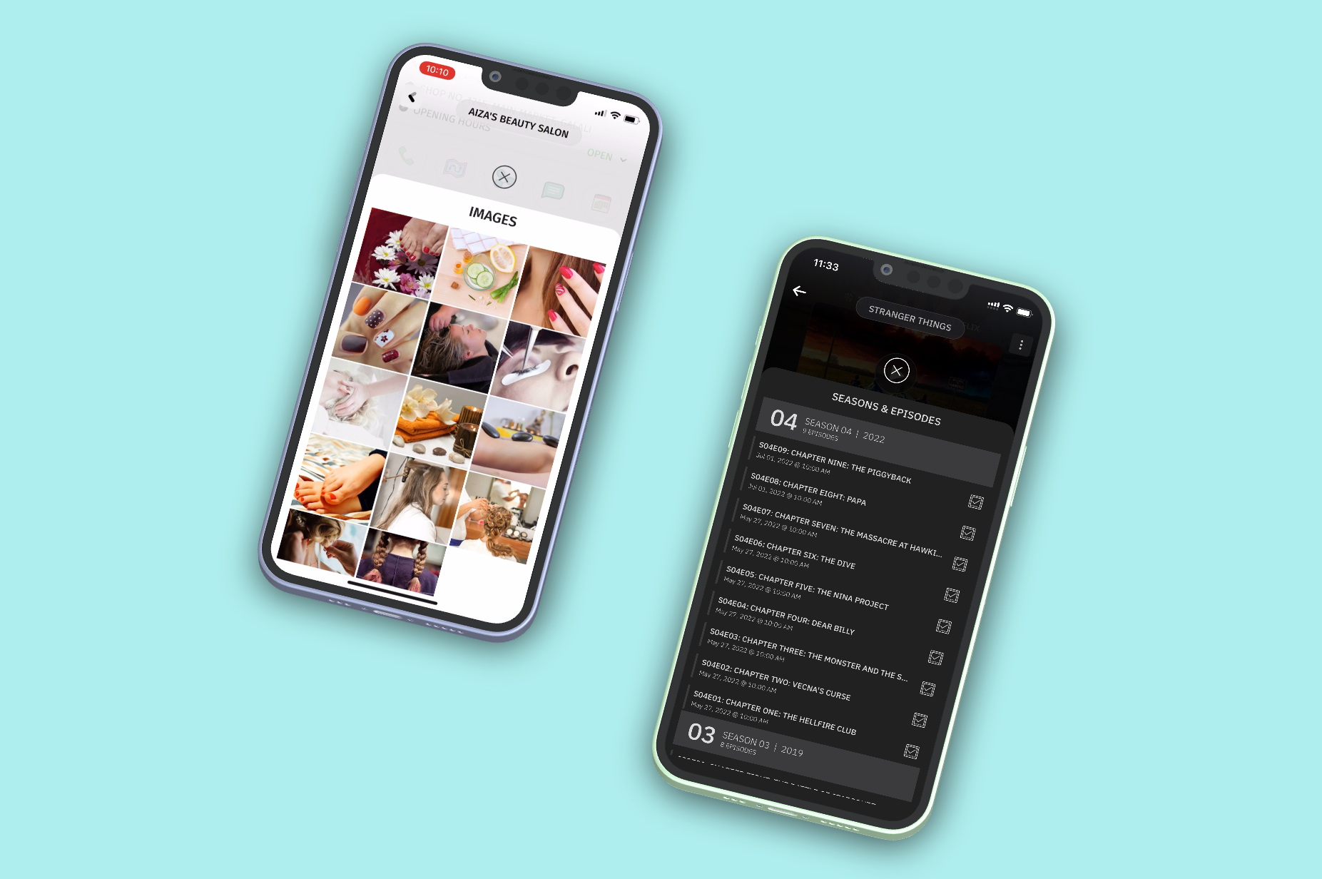
Personally, I am not a huge fan of navigation and tabs when it comes to showing related content on a page. I prefer to keep the UI simple, and stuff in infrequently used content inside a hidden Bottom Sheet, which I can slide up when the user really wants to view it. Bottom Sheet is mostly an iOS pattern, and I am by no means, suggesting that this is the best way to show related information. Everyone has a different use case and prefers to work with the UI pattern(s) of their choice. For me, this is what I mostly use in my apps. As an example, see how I am using it in two of my apps (to show an image gallery or a list of seasons/episodes). In fact, I recently tweeted a video of how I am showing multiple content using bottom sheets on the same page. You can check out the tweet here.
So, this is the control we are going to be building. It is a XAML-based control which you can add to any MAUI page (or in fact multiple controls in the same page) and show additional content when requested by the user.
The Implementation
The full source code of this control and sample app is available on Github for you to play with.
Ideally, this control should have been implemented as a ControlTemplate with a ContentPresenter inside it. But I encountered some run-time issues in iOS (Android was working fine). So after banging my head around for few hours, I decided to implement it as plain ContentView. Might be some issue with .Net Maui, which I will investigate further (and later) and change the implementation once I am able to figure out the issue. Regardless, the below is a much cleaner and simpler implementation; no TemplateBindings and GetPart(....) complexities.
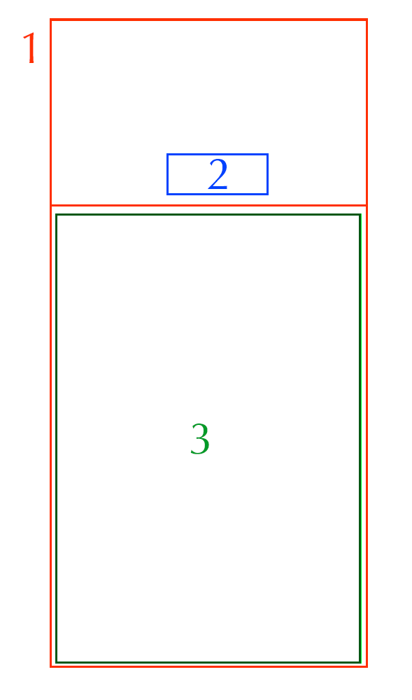
Let's dive into it. Simply speaking, this control consists of just three UI main components (hosted inside of a XAML ContentView) which we will be detailing out below, and a set of Bindable Properties which we will use in our MAUI pages to customize the content and look/feel of the bottom sheets, along with a couple of methods to open and close the bottom sheet.
- A grid with two rows
- A close button
- Template Area to host your custom content
The Bindable Properties
Before we go into details of the UI components, let's look at 4 custom Bindable Properties that we need to implement. These will be used to customize the UI of the Botton Sheet and (partially) define the content (I will get to that in UI Component No. 3).
- HeaderText: This is the text which will be displayed as the header of the bottom sheet.
- HeaderStyle: The header text can be styled as needed. By default, it uses the default font with FontSize of 24, but you can provide your own custom Label Style.
- Theme: Defines the theme of the bottom sheet. It is based on enum values of Light and Dark. The bottom sheet color changes based on this theme (white for light theme and dark gray for Dark theme). For my apps, this enum is enough. However I would suggest that if you want further customization, better change this from enum to actual color which bottom sheet background is bound to.
- SheetHeight: This is perhaps the most important property. This defines the height of the content area of the bottom sheet (UI component 3 above).
    #region Bindable Properties

    public static readonly BindableProperty SheetHeightProperty = BindableProperty.Create(
        nameof(SheetHeight),
        typeof(double),
        typeof(BottomSheet),
        360d,
        BindingMode.OneWay,
        validateValue: (_, value) => value != null);

    public double SheetHeight
    {
        get => (double)GetValue(SheetHeightProperty);
        set => SetValue(SheetHeightProperty, value);
    }

    public static readonly BindableProperty HeaderTextProperty = BindableProperty.Create(
        nameof(HeaderText),
        typeof(string),
        typeof(BottomSheet),
        string.Empty,
        BindingMode.OneWay,
        validateValue: (_, value) => value != null);

    public string HeaderText
    {
        get => (string)GetValue(HeaderTextProperty);
        set => SetValue(HeaderTextProperty, value);
    }

    public static readonly BindableProperty HeaderStyleProperty = BindableProperty.Create(
        nameof(HeaderStyle),
        typeof(Style),
        typeof(BottomSheet),
        new Style(typeof(Label))
        {
            Setters =
            {
                new Setter
                {
                    Property = Label.FontSizeProperty,
                    Value = 24
                }
            }
        },
        BindingMode.OneWay,
        validateValue: (_, value) => value != null);

    public Style HeaderStyle
    {
        get => (Style)GetValue(HeaderStyleProperty);
        set => SetValue(HeaderStyleProperty, value);
    }

    public static readonly BindableProperty ThemeProperty = BindableProperty.Create(
        nameof(Theme),
        typeof(DisplayTheme),
        typeof(BottomSheet),
        DisplayTheme.Light,
        BindingMode.OneWay,
        validateValue: (_, value) => value != null,
        propertyChanged:
        (bindableObject, oldValue, newValue) =>
        {
            if (newValue is not null && bindableObject is BottomSheet sheet && newValue != oldValue)
            {
                sheet.UpdateTheme();
            }
        });

    public DisplayTheme Theme
    {
        get => (DisplayTheme)GetValue(ThemeProperty);
        set => SetValue(ThemeProperty, value);
    }

    private void UpdateTheme()
    {
        MainContent.BackgroundColor = Color.FromArgb(Theme == DisplayTheme.Dark ? "#333333" : "#FFFFFF");
        MainContent.Stroke = Color.FromArgb(Theme == DisplayTheme.Dark ? "#333333" : "#FFFFFF");
    }

    #endregion
The Main Grid Properties
The whole UI is enclosed inside of a grid which also serves as a fader to cover the main screen. This grid has two rows, one will house the close bottom and the second one the actual bottom sheet content. Please pay special attention to the definition of the 2nd row. The height of the 2nd row is adjusted based on the SheetHeight property provided by the user.
        <Grid
            x:Name="BackgroundFader"
            BackgroundColor="#DDCCCCCC"
            IsVisible="false"
            Opacity="0">

            <Grid.RowDefinitions>
                <RowDefinition Height="*" />
                <RowDefinition Height="{Binding Source={x:Reference BottomSheetControlRoot}, Path=SheetHeight, Mode=OneWay}" />
            </Grid.RowDefinitions>

        </Grid>
The Close Button
Not much to talk about here. It's a simple image (hosted in the first row) which has the close icon and when clicked, will call the common method (which I will explain in the later section) to close the bottom sheet. A couple of minor observations here:
- I could have gone with ImageButton instead of Image (to avoid the TapGestureRecognizer), but being a button, it adds a pressed animation, which I would have to remove from the visual states. I decided to not spend time on it as this is not the main complexity of the control. But feel free to change it to ImageButton, if it suites you better.
- In order to localize the close icon inside of the control, I added the icon as an Embedded Resource in the project (rightfully so). But since this was the only one embedded image, I decided not to write an ImageExtention to make binding via XAML possible. Instead, I took the simple route of setting the image source via code in the constructor (see below). You see, the kind of stupid choices we Devs make sometimes 😉.
            <!-- Close Button -->
            <Image
                x:Name="CloseBottomSheetButton"
                Grid.Row="0"
                HeightRequest="40"
                WidthRequest="40"
                IsVisible="False"
                Opacity="0"
                HorizontalOptions="Center"
                VerticalOptions="End"
                Margin="0,0,0,16">

                <Image.GestureRecognizers>
                    <TapGestureRecognizer Tapped="CloseBottomSheetButton_Tapped" />
                </Image.GestureRecognizers>

            </Image>
        //Set Close Icon from Local Resource
        CloseBottomSheetButton.Source = ImageSource.FromResource($"XGENO.Maui.Controls.BottomSheet.icnmenuclose.png");
Meat of the Bottom Sheet
I would say that this is the most important piece of the puzzle. This is made up of a single Border control which is hosted inside of the 2nd row of the main grid. It has rounded corners on the top left and right. Recall the Theme property above? That property is what is used to set the background color of this control. This control houses the main content that you want to show in your pages. Please do look out for TranslationY property on this border control. It is set to SheetHeight bindable property. Basically, this is pushing the control off screen, and we will slide it up or down when opening or closing the bottom sheet programmatically (see Common Methods section below).
            <!-- Enclosing Border Control for Content -->
            <Border
                x:Name="MainContent"
                Grid.Row="1"
                Padding="24,24,24,0"
                Margin="-1"
                VerticalOptions="Fill"
                HorizontalOptions="Fill"
                StrokeThickness="0"
                TranslationY="{Binding Source={x:Reference BottomSheetControlRoot}, Path=SheetHeight, Mode=OneWay}">

                <Border.StrokeShape>
                    <RoundRectangle CornerRadius="32,32,0,0"/>
                </Border.StrokeShape>

            </Border>
Inside this border control is a grid with 2 rows. The first row contains a label which serves as the Bottom Sheet Header and the text and style can be set using the HeaderText and HeaderStyle properties defined above.
                    <!-- Header Content -->
                    <Label
                        x:Name="HeaderLabel"
                        Style="{Binding Source={x:Reference BottomSheetControlRoot}, Path=HeaderStyle, Mode=OneWay}"
                        Text="{Binding Source={x:Reference BottomSheetControlRoot}, Path=HeaderText, Mode=OneWay}"
                        Grid.Row="0"
                        HorizontalOptions="Center"
                        VerticalOptions="Center"
                        VerticalTextAlignment="Center" />
And now to the most important part. The 2nd row contains only a grid. This is where you will pass on the content that you want to show in the bottom sheet from your pages. As mentioned above, this ideally should have been done using ContentPresenter inside of a ControlTemplate, but due to some iOS issue, I decided to go with this route.
                    <!-- Main Content -->
                    <Grid
                        x:Name="BottomSheetContentGrid"
                        Grid.Row="1" />
Once this grid control is defined, it needs to be exposed to the developer so that it can be used in XAML (or code-behind).
public IList<Microsoft.Maui.IView> BottomSheetContent => BottomSheetContentGrid.Children;
The Common Methods
The control exposes a couple of methods which you can call to open and close the bottom sheet. These methods are exact reverse of each other. The open method simply fades the background in, slides the bottom sheet up from the bottom, and fades in the close icon. The only important thing to note here is the setting of InputTransparent property. This is to counter the bug which I have been noticing in Android since Maui Preview 12. The bug is pertaining to input transparency of the top layer grid control. It makes the underlying content (or content behind the grid) also clickable.
    public async Task OpenBottomSheet()
    {
        this.InputTransparent = false;
        BackgroundFader.IsVisible = true;
        CloseBottomSheetButton.IsVisible = true;

        _ = BackgroundFader.FadeTo(1, shortDuration, Easing.SinInOut);
        await MainContent.TranslateTo(0, 0, regularDuration, Easing.SinInOut);
        _ = CloseBottomSheetButton.FadeTo(1, regularDuration, Easing.SinInOut);
    }

    public async Task CloseBottomSheet()
    {
        await CloseBottomSheetButton.FadeTo(0, shortDuration, Easing.SinInOut);
        _ = MainContent.TranslateTo(0, SheetHeight, shortDuration, Easing.SinInOut);
        await BackgroundFader.FadeTo(0, shortDuration, Easing.SinInOut);

        BackgroundFader.IsVisible = true;
        CloseBottomSheetButton.IsVisible = true;
        this.InputTransparent = true;
    }
Example Usage
Using this control is pretty simple. Please refer to the sample app in the Github repository for some examples. Here is a simple example which shows a piece of text when opened:
        <controls:BottomSheet
            x:Name="simpleBottomSheet"
            HeaderText="Simple Example">
            <controls:BottomSheet.BottomSheetContent>
                <Label
                    Text="Hello from Bottom Sheet. This is a simple implementation with no customization."
                    VerticalOptions="Center"
                    HorizontalOptions="Center"
                    HorizontalTextAlignment="Center" />
            </controls:BottomSheet.BottomSheetContent>
        </controls:BottomSheet>
The Result
Here is the sample application in action. You can head over to Github to grab the source code and play with it yourself.
BottomSheet.mp4 (in case it doesn't auto play in browser)