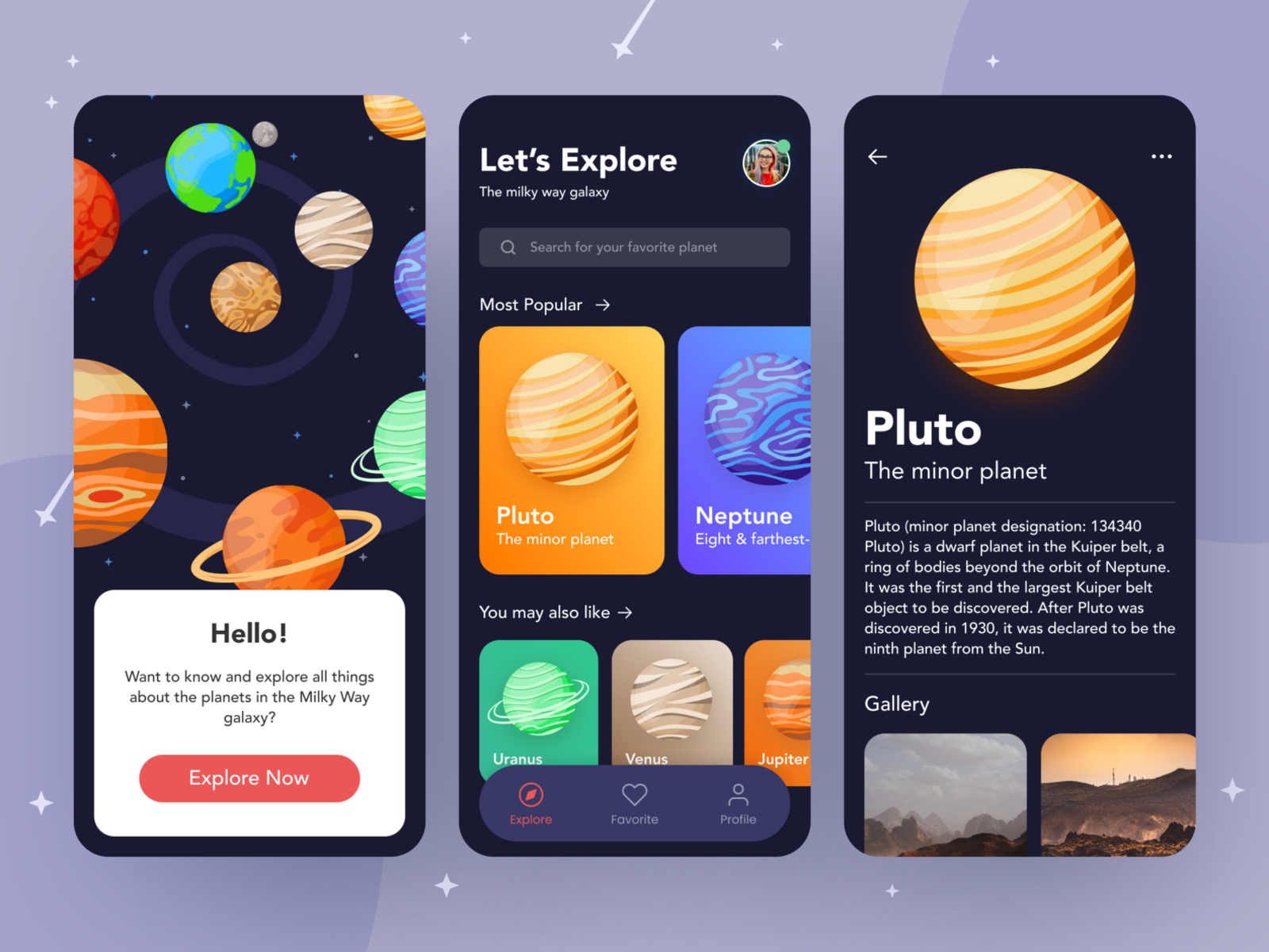
[This is Part 1 of the 2-part series where we build a .Net Maui app as part of the amazing #MAUIUIJuly initiative by Matt Goldman]
Captain: Houston, this is the captain of Starboard MAUI-Net-6.0 outbound for the Solar system. Do you read me?
Houston: Yes Captain, loud and clear.
Captain: We are in earth's orbit now. Ready to blast off to explore the outer planets of the solar system.
Houston: Copy Captain and God Speed. Over and Out!!!
Ok, Ok. I hear you. I don't need be that melodramatic. I was just building up the plot for my readers. After all, .Net Maui traveling to the space is not a small thing. Right?
The Design
So, as part of the .NET MAUI UI JULY initiative, I decided to take this wonderful design from Dribbble and implement it using .Net Maui. It's a pretty amazing work by Aan Ragil. I hope I did justice to his design while implementing in Maui.

The Implementation
The full source code of this app is available on Github for you to play with. There are 3 pages to be implemented. I will emphasize on the key sections in each of the page.
There is a lot to be done in this app, so I will be splitting this blog post and implementation into 2 parts. This is part 1, where we set up the project (including the basics) and implement the first page. We will complete the remaining two pages in part 2. So let's get rolling.
The Setup
Before we dive into each of the page, let us setup our project first. I created a blank .Net Maui app. In order to get the full immersive experience on the screen, I disabled the Navigation Bar on every page and set the page background color to the desired color. This was done using styles in App.xaml file.
        <!-- Content Page Style -->
        <Style TargetType="ContentPage" ApplyToDerivedTypes="True">
            <Setter Property="NavigationPage.HasNavigationBar" Value="False" />
            <Setter Property="BackgroundColor" Value="{StaticResource PageBackgroundColor}" />
            <Setter Property="Padding" Value="0"/>
        </Style>

        <!-- Navigation Page -->
        <Style TargetType="NavigationPage" ApplyToDerivedTypes="True">
            <Setter Property="BackgroundColor" Value="{StaticResource PageBackgroundColor}" />
        </Style>
This provides a full immersive experience at the top of the screen and extends directly into the status bar on iOS. However, we need to tap into the Android LifeCycle events to make the status bar translucent.
		builder
			.UseMauiApp<App>()
			.ConfigureFonts(fonts =>
			{
				fonts.AddFont("Montserrat-Medium.ttf", "RegularFont");
                fonts.AddFont("Montserrat-SemiBold.ttf", "MediumFont");
                fonts.AddFont("Montserrat-Bold.ttf", "BoldFont");
			})
            .ConfigureLifecycleEvents(events =>
            {
#if ANDROID
                events.AddAndroid(android => android
                    .OnCreate((activity, bundle) => MakeStatusBarTranslucent(activity)));

                static void MakeStatusBarTranslucent(Android.App.Activity activity)
                {
                    activity.Window.SetFlags(Android.Views.WindowManagerFlags.LayoutNoLimits, Android.Views.WindowManagerFlags.LayoutNoLimits);

                    activity.Window.ClearFlags(Android.Views.WindowManagerFlags.TranslucentStatus);

                    activity.Window.SetStatusBarColor(Android.Graphics.Color.Transparent);
                }
#endif
            });
To extend into the bottom navigation handle, we will be using the IgnoreSafeArea in each of the page. This is how the general page setup will look like:
<ContentPage>
    <Grid IgnoreSafeArea="{OnPlatform Android=False, iOS=True}">
    </Grid>
</ContentPage>
For fonts, I decided to go with Montserrat. You can find it on Google Fonts. I sourced the planet icons from FreePik. And finally, the information on the planets was sourced from here and here.
To keep things simple, I have not implemented MVVM pattern in this project and kept it as plain-vanilla Maui UI architecture. I created a Planet class to hold information on the planets and a PlanetService class to serve this information.
The Start Page
Let's decipher the start page. I have broken the page into two parts.

The top part is made up of individual images of each of the planets. I am controlling the positions and sizes of each of the images using HorizontalOptions, VerticalOptions, TranslationX, TranslationY, WidthRequest and HeightRequest. Here is an example of earth image in action. This places the earth image at top center, but offset little bit to the left and further down the page.
        <Image
            Source="earth.png"
            VerticalOptions="Start"
            HorizontalOptions="Center"
            TranslationX="-48"
            TranslationY="148"
            WidthRequest="96"
            HeightRequest="96"/>
For the bottom part, I decided to go with the new lighter-weight Border control, rather than the Frame control. This is the theme throughout the application. Unless absolutely necessary, I would recommend avoid using Frame control.
        <Border
            Padding="24,32"
            BackgroundColor="{StaticResource FrameBackgroundColor}"
            Stroke="{StaticResource BorderColor}"
            HorizontalOptions="Fill"
            VerticalOptions="End"
            Margin="20">
            <Border.StrokeShape>
                <RoundRectangle CornerRadius="24"/>
            </Border.StrokeShape>

            <VerticalStackLayout
                Spacing="16">

                <Label
                    HorizontalOptions="Center"
                    HorizontalTextAlignment="Center"
                    Style="{StaticResource IntroPageHeaderStyle}"
                    Text="Hello!"/>


                <Label
                    HorizontalOptions="Center"
                    HorizontalTextAlignment="Center"
                    LineBreakMode="WordWrap"
                    Style="{StaticResource IntroPageTextStyle}"
                    Text="Want to know and explain all things about the planets in the Milky Way galaxy?"/>

                <Button
                    Style="{StaticResource ButtonStyle}"
                    Text="Explore Now"
                    HorizontalOptions="Center"
                    Margin="0,12,0,6"
                    Clicked="ExploreNow_Clicked"/>

            </VerticalStackLayout>

        </Border>
And this is the result for the first page:

Looks pretty good, huh? But we can do one better. If you know me, I don't settle for less. Though it is not the design, we can add some simple animations (just some random fade-in effects for now) to make it look neater. Of course, there are better animations that can be added, e.g. slide-in or scale-in effects along with fade-ins, but that's for another day. We can set the initial opacity of each of the controls on the page to "0" and then fade them in using a nested animation in the OnAppearing event.
    protected override async void OnAppearing()
    {
        base.OnAppearing();

        if (this.AnimationIsRunning("TransitionAnimation"))
            return;

        var parentAnimation = new Animation();

        //Planets Animation
        parentAnimation.Add(0, 0.2, new Animation(v => imgMercury.Opacity = v, 0, 1, Easing.CubicIn));
        parentAnimation.Add(0.1, 0.3, new Animation(v => imgVenus.Opacity = v, 0, 1, Easing.CubicIn));
        parentAnimation.Add(0.2, 0.4, new Animation(v => imgEarth.Opacity = v, 0, 1, Easing.CubicIn));
        parentAnimation.Add(0.3, 0.5, new Animation(v => imgMars.Opacity = v, 0, 1, Easing.CubicIn));
        parentAnimation.Add(0.4, 0.6, new Animation(v => imgJupiter.Opacity = v, 0, 1, Easing.CubicIn));
        parentAnimation.Add(0.5, 0.7, new Animation(v => imgSaturn.Opacity = v, 0, 1, Easing.CubicIn));
        parentAnimation.Add(0.6, 0.8, new Animation(v => imgNeptune.Opacity = v, 0, 1, Easing.CubicIn));
        parentAnimation.Add(0.7, 0.9, new Animation(v => imgUranus.Opacity = v, 0, 1, Easing.CubicIn));

        //Intro Box Animation
        parentAnimation.Add(0.7, 1, new Animation(v => frmIntro.Opacity = v, 0, 1, Easing.CubicIn));

        //Commit the animation
        parentAnimation.Commit(this, "TransitionAnimation", 16, 3000, null, null);
    }
The Result
Here is the application so far in action. You can head over to Github to grab the source code and play with it yourself. Stay tuned for Part 2 where we add the remaining two pages.
MauiPlanets1.mp4 (in case it doesn't auto play in browser)